
Recently, I had the opportunity to deal with crypto exchange public data and this allowed me to visually explore the data using Plotly libraries, one of the best visualization tools available, as it will enable us to have general interactive graphs without worrying about coding part — like I used to do with Bokeh.
If you’re using notebooks for analysis, to keep things clean, I suggest you write helper functions on a .py file and then import it.
I’ll share the code, so you’ll be able to see how Plotly works and adapt it to use with your data
So let’s dive in!
Understand the data
The first thing to do is, as always, is gain intuition about the data so we can be more effective on which kind of visualizations adopt.
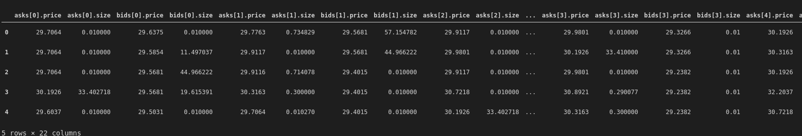
In this case, the data is a set of different files, day by day, containing info about the depth of order book (DOB files) and the trades (trades files).
The first operation is to collect all the files and aggregate it, building a DataFrame containing all the data within a time range — four months in this case.
The DOB data contains the best 5 asks and 5 bids levels with prices and sizes, from best to worst and timestamp data.
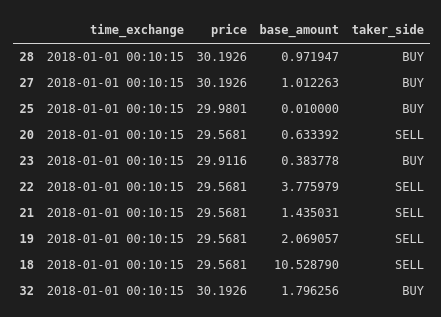
The trades data contains info on the executed trades, with the price, base and taker side (buy or sell).
Nothing particularly exotic, so let’s start doing some EDA.
DOB EDA
Box plots are one of the coolest ways to visualize how data is distributed, so let’s begin with them, seeing both sizes and prices
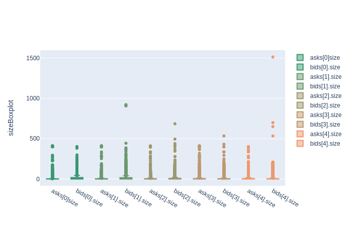
We can already see the data is skewed, as median values are very low and there are evident outliers. Let’s zoom in, something with Plotly you can do directly on the graph while having numeric info performing a mouseover.
Moreover, it’s possible to filter, just by clicking on the legend.
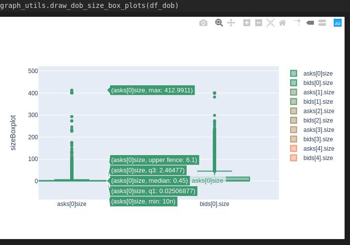
We can see the median value is 0.45, with max equals to 412 and a lot of outliers between.
The code:
import plotly.graph_objs as go
# specific function
def draw_dob_size_box_plots(df_dob):
    _draw_dob_box_plots(df_dob, 'size')
# generic "private" function
def _draw_dob_box_plots(df_dob, size_or_price):
    trace_asks0 = go.Box(
        y=df_dob['asks[0].' + size_or_price],
        name='asks[0]' + size_or_price,
        marker=dict(
            color='#3D9970'
        )
    )
    trace_bids0 = go.Box(
        y=df_dob['bids[0].' + size_or_price],
        name='bids[0].' + size_or_price,
        marker=dict(
            color='#3D9970'
        )
    )
    trace_asks1 = go.Box(
        y=df_dob['asks[1].' + size_or_price],
        name='asks[1].' + size_or_price,
        marker=dict(
            color='#6D9970'
        )
    )
    trace_bids1 = go.Box(
        y=df_dob['bids[1].' + size_or_price],
        name='bids[1].' + size_or_price,
        marker=dict(
            color='#6D9970'
        )
    )
    trace_asks2 = go.Box(
        y=df_dob['asks[2].' + size_or_price],
        name='asks[2].' + size_or_price,
        marker=dict(
            color='#9D9970'
        )
    )
    trace_bids2 = go.Box(
        y=df_dob['bids[2].' + size_or_price],
        name='bids[2].' + size_or_price,
        marker=dict(
            color='#9D9970'
        )
    )
    trace_asks3 = go.Box(
        y=df_dob['asks[3].' + size_or_price],
        name='asks[3].' + size_or_price,
        marker=dict(
            color='#BD9970'
        )
    )
    trace_bids3 = go.Box(
        y=df_dob['bids[3].' + size_or_price],
        name='bids[3].' + size_or_price,
        marker=dict(
            color='#BD9970'
        )
    )
    trace_asks4 = go.Box(
        y=df_dob['asks[4].' + size_or_price],
        name='asks[4].' + size_or_price,
        marker=dict(
            color='#ED9970'
        )
    )
    trace_bids4 = go.Box(
        y=df_dob['bids[4].' + size_or_price],
        name='bids[4].' + size_or_price,
        marker=dict(
            color='#ED9970'
        )
    )
data = [trace_asks0, trace_bids0, trace_asks1, trace_bids1,                          trace_asks2, trace_bids2, \
            trace_asks3, trace_bids3, trace_asks4, trace_bids4]
    layout = go.Layout(
        yaxis=dict(
            title=size_or_price + 'Boxplot',
            zeroline=False
        )
    )
    fig = go.Figure(data=data, layout=layout)
    fig.show()
As you can see, the code is straightforward: you build different data visualization from a specific source, setting specific visualization options and then put all together. So, with relatively few lines, is possible to construct a graph with multiple data and interactive.
Let’s do the same with the prices
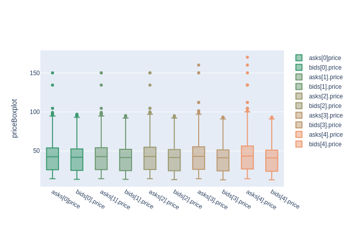
Here, the data is less skewed, but outliers are clearly visible.
If you want to know more about box plots, start from here.
As we are dealing with time-series, time is a relevant factor. Let’s begin to see how data is distributed through time.
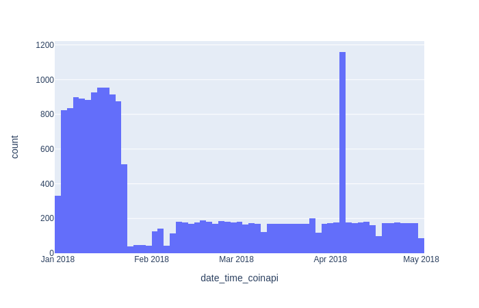
We can see a great number of elements in January and even a spike in April.
Just to show how is easy to build this graph, this is the code used:
import plotly.express as px
df = px.data.tips()
fig = px.histogram(df_dob, x=”date_time_coinapi”)
fig.show()
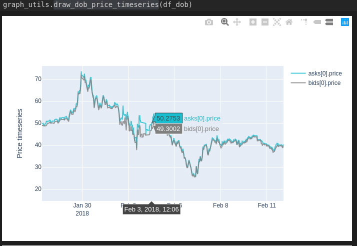
Let’s see how asks and bids are varying through time. For simplicity, I’ll put just the first level, but the code renders all the levels.
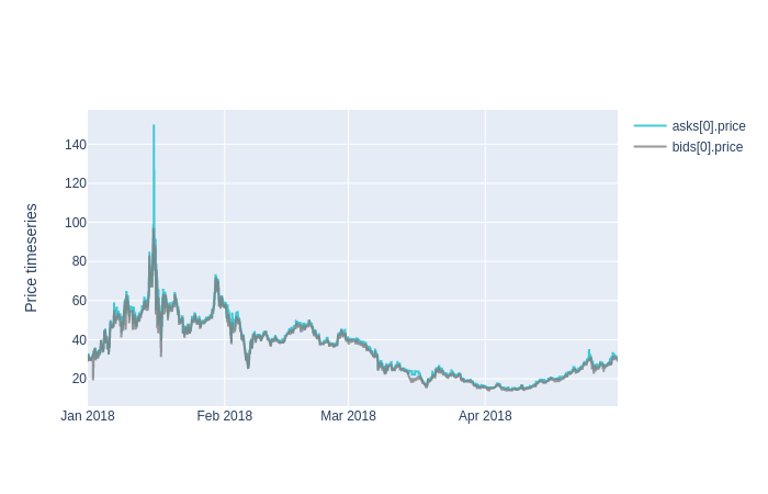
It’s super easy to zoom in and check some values.
The code:
import plotly.graph_objs as go
def draw_dob_price_timeseries(df_dob):
    elements0 = ['asks[0].price','bids[0].price']
    elements1 = ['asks[1].price','bids[1].price']
    elements2 = ['asks[2].price','bids[2].price']
    elements3 = ['asks[3].price','bids[3].price']
    elements4 = ['asks[4].price','bids[4].price']
    elements = [elements0, elements1, elements2, elements3, elements4]
    for el in elements:
        _draw_dob_timeseries(df_dob, el, 'Price timeseries')
def _draw_dob_timeseries(df_dob, elements, title):
    trace_asks0 = go.Scatter(
        x = df_dob.date_time_exchange,
        y=df_dob[elements[0]],
        name=elements[0],
        line = dict(color = '#17BECF'),
        opacity = 0.8
    )
    trace_bids0 = go.Scatter(
        x = df_dob.date_time_exchange,
        y=df_dob[elements[1]],
        name=elements[1],
        line = dict(color = '#7F7F7F'),
        opacity = 0.8
    )
    data = [trace_asks0, trace_bids0]
    layout = go.Layout(
        yaxis=dict(
            title=title,
            zeroline=False
        )
    )
    fig = go.Figure(data=data, layout=layout)
    fig.show()


def _draw_dob_box_plots(df_dob, size_or_price):
    trace_asks0 = go.Box(
        y=df_dob['asks[0].' + size_or_price],
        name='asks[0]' + size_or_price,
        marker=dict(
            color='#3D9970'
        )
    )
    trace_bids0 = go.Box(
        y=df_dob['bids[0].' + size_or_price],
        name='bids[0].' + size_or_price,
        marker=dict(
            color='#3D9970'
        )
    )
    trace_asks1 = go.Box(
        y=df_dob['asks[1].' + size_or_price],
        name='asks[1].' + size_or_price,
        marker=dict(
            color='#6D9970'
        )
    )
    trace_bids1 = go.Box(
        y=df_dob['bids[1].' + size_or_price],
        name='bids[1].' + size_or_price,
        marker=dict(
            color='#6D9970'
        )
    )
    trace_asks2 = go.Box(
        y=df_dob['asks[2].' + size_or_price],
        name='asks[2].' + size_or_price,
        marker=dict(
            color='#9D9970'
        )
    )
    trace_bids2 = go.Box(
        y=df_dob['bids[2].' + size_or_price],
        name='bids[2].' + size_or_price,
        marker=dict(
            color='#9D9970'
        )
    )
    trace_asks3 = go.Box(
        y=df_dob['asks[3].' + size_or_price],
        name='asks[3].' + size_or_price,
        marker=dict(
            color='#BD9970'
        )
    )
    trace_bids3 = go.Box(
        y=df_dob['bids[3].' + size_or_price],
        name='bids[3].' + size_or_price,
        marker=dict(
            color='#BD9970'
        )
    )
    trace_asks4 = go.Box(
        y=df_dob['asks[4].' + size_or_price],
        name='asks[4].' + size_or_price,
        marker=dict(
            color='#ED9970'
        )
    )
    trace_bids4 = go.Box(
        y=df_dob['bids[4].' + size_or_price],
        name='bids[4].' + size_or_price,
        marker=dict(
            color='#ED9970'
        )
)
data = [trace_asks0, trace_bids0, trace_asks1, trace_bids1, trace_asks2, trace_bids2, \
            trace_asks3, trace_bids3, trace_asks4, trace_bids4]
    layout = go.Layout(
        yaxis=dict(
            title=size_or_price + 'Boxplot',
            zeroline=False
        )
    )
    fig = go.Figure(data=data, layout=layout)
    fig.show()
A bit more code here but the same structure.
Trades EDA
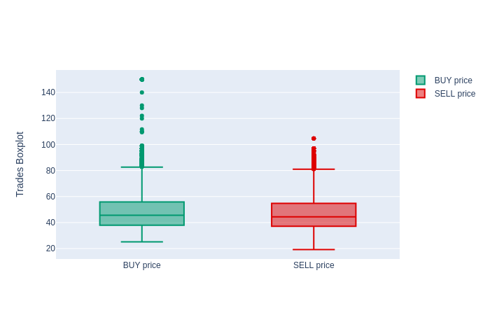
Let’s start with box plots too, focusing on price in buy and sell:
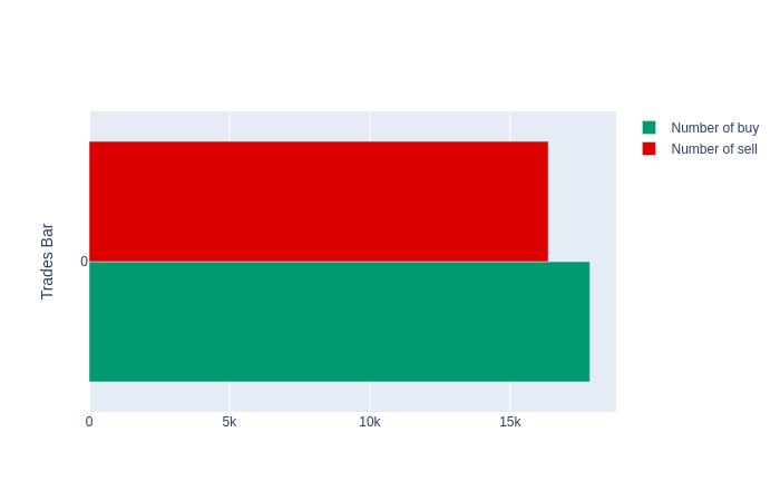
and then a bar plot, to see the amount of buy and sell operations:
import plotly.graph_objs as go
def draw_trades_bars(df_trades):
    trace0 = go.Bar(
        x = np.array(df_trades[df_trades.taker_side ==  'BUY'].price.count()),
        name = 'Number of buy',
        marker=dict(
            color='#009970')
    )
trace1 = go.Bar(
        x = np.array(df_trades[df_trades.taker_side == 'SELL'].price.count()),
        name = 'Number of sell',
        marker=dict(
            color='#DD0000')
    )

    data = [trace0, trace1]
    layout = go.Layout(
        yaxis=dict(
            title='Trades Bar',
            zeroline=False
        )
    )
    fig = go.Figure(data=data, layout=layout)
    fig.show()
As you can see, the structure is always the same but in this case, we use go.Bar instead of go.Scatter.
Let’s see the histogram of trades:
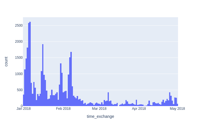
After February, less activity, with no spikes.
Combined EDA
Let’s put everything together and see if we can gain more intuition about the data.
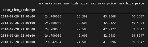
To simplify the analysis, we’ll aggregate both data, resampling at 1-hour interval and taking the max value of the 5 five values.
RESAMPLE_TIME = '1H'
df_dob_resampled = df_dob.copy()
df_dob_resampled.index = df_dob_resampled['date_time_exchange']
df_dob_resampled = df_dob_resampled.resample(RESAMPLE_TIME).max()
df_dob_resampled.drop(columns=['date_time_exchange','date_time_coinapi'], inplace=True)
df_dob_resampled['max_asks_size'] = df_dob_resampled[['asks[0].size','asks[1].size', 'asks[2].size', 'asks[3].size', 'asks[4].size']].max(axis=1)
df_dob_resampled['max_bids_size'] = df_dob_resampled[['bids[0].size','bids[1].size', 'bids[2].size', 'bids[3].size', 'bids[4].size']].max(axis=1)
df_dob_resampled['max_asks_price'] = df_dob_resampled[['asks[0].price','asks[1].price', 'asks[2].price', 'asks[3].price', 'asks[4].price']].max(axis=1)
df_dob_resampled['max_bids_price'] = df_dob_resampled[['bids[0].price','bids[1].price', 'bids[2].price', 'bids[3].price', 'bids[4].price']].max(axis=1)
df_dob_resampled.drop(columns=[
                      'asks[0].size','asks[1].size', 'asks[2].size', 'asks[3].size', 'asks[4].size', \
                      'bids[0].size','bids[1].size', 'bids[2].size', 'bids[3].size', 'bids[4].size', \
                      'asks[0].price','asks[1].price', 'asks[2].price', 'asks[3].price', 'asks[4].price', \
                      'bids[0].price','bids[1].price', 'bids[2].price', 'bids[3].price', 'bids[4].price'], inplace=True)
Obtaining something like this:
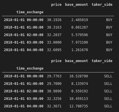
Let’s do the same with trade data, splitting between sell and buy:
Now we can build a time-series graph putting together the DOB and the trades and see if something strange happened:
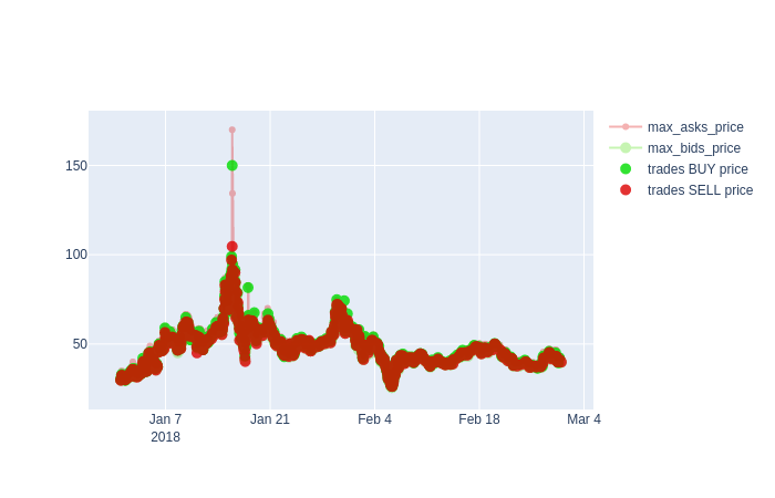
Around middle January there is an anomaly, let’s zoom in:
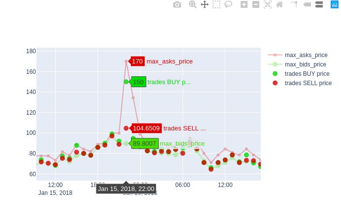
We can see a sudden rise in ask price and this can be a signal of a “spoof” tentative, an illegal practice where buyers manipulate the market paying a higher price and pushing the price even higher due to a cumulative effect of the actions of other buyers.
import plotly.graph_objs as go
def draw_max_timeseries(df_dob_resampled, df_trades_resampled_buy, df_trades_resampled_sell, title):
    trace0 = go.Scatter(
        x = df_dob_resampled.index,
        y = df_dob_resampled['max_asks_price'],
        mode = 'lines+markers',
        name='max_asks_price',
        line = dict(color = '#dd0000', shape = 'linear'),
        opacity = 0.3,
        connectgaps=True
    )
    trace1 = go.Scatter(
        x = df_dob_resampled.index,
        y = df_dob_resampled['max_bids_price'],
        name='max_bids_price',
        mode = 'lines+markers',
        marker = dict(
            size = 10,
            color = '#44dd00'),
        opacity = 0.3
    )
    trace2 = go.Scatter(
        x = df_trades_resampled_buy.index,
        y = df_trades_resampled_buy.price,
        name='trades BUY price',
        mode = 'markers',
        marker = dict(
            size = 10,
            color = '#00dd00'),
        opacity = 0.8
    )
    trace3 = go.Scatter(
        x = df_trades_resampled_sell.index,
        y = df_trades_resampled_sell.price,
        name='trades SELL price',
        mode = 'markers',
        marker = dict(
            size = 10,
            color = '#dd0000'),
        opacity = 0.8
    )
data = [trace0, trace1, trace2, trace3]
    layout = go.Layout(
        yaxis=dict(
            title=title,
            zeroline=True
        )
    )
    fig = go.Figure(data=data, layout=layout)
    fig.show()
draw_max_timeseries(df_dob_resampled, df_trades_resampled_buy, df_trades_resampled_sell, 'Max aggregated data timeseries')
As we set resampled time to 1 hour, if we want to have more granularity on that period w.t.r time, we have to slice that interval (let’s pick four hours) and resample, for instance using 60 seconds. Let’s do it!
RESAMPLE_TIME = '60s'
START_INTERVAL = '2018-01-15 22:00:00'
END_INTERVAL = '2018-01-16 02:00:00'

df_dob_resampled_interval = df_dob.copy()

df_dob_resampled_interval.index = df_dob_resampled_interval['date_time_exchange']

df_dob_resampled_interval = df_dob_resampled_interval[START_INTERVAL:END_INTERVAL]

df_dob_resampled_interval = df_dob_resampled_interval.resample(RESAMPLE_TIME).max()

df_dob_resampled_interval.drop(columns=['date_time_exchange','date_time_coinapi'], inplace=True)

df_dob_resampled_interval['max_asks_size'] = df_dob_resampled_interval[['asks[0].size','asks[1].size', 'asks[2].size', 'asks[3].size', 'asks[4].size']].max(axis=1)

df_dob_resampled_interval['max_bids_size'] = df_dob_resampled_interval[['bids[0].size','bids[1].size', 'bids[2].size', 'bids[3].size', 'bids[4].size']].max(axis=1)

df_dob_resampled_interval['max_asks_price'] = df_dob_resampled_interval[['asks[0].price','asks[1].price', 'asks[2].price', 'asks[3].price', 'asks[4].price']].max(axis=1)

df_dob_resampled_interval['max_bids_price'] = df_dob_resampled_interval[['bids[0].price','bids[1].price', 'bids[2].price', 'bids[3].price', 'bids[4].price']].max(axis=1)

df_dob_resampled_interval.drop(columns=[
                      'asks[0].size','asks[1].size', 'asks[2].size', 'asks[3].size', 'asks[4].size', \
                      'bids[0].size','bids[1].size', 'bids[2].size', 'bids[3].size', 'bids[4].size', \
                      'asks[0].price','asks[1].price', 'asks[2].price', 'asks[3].price', 'asks[4].price', \
                      'bids[0].price','bids[1].price', 'bids[2].price', 'bids[3].price', 'bids[4].price'], inplace=True)

df_dob_resampled_interval.head()
df_trades_resampled_interval = df_trades.copy()
df_trades_resampled_interval.index = df_trades_resampled_interval['time_exchange']

df_trades_resampled_interval = df_trades_resampled_interval[START_INTERVAL:END_INTERVAL]

df_trades_resampled_interval_buy = df_trades_resampled_interval[df_trades_resampled_interval.taker_side == 'BUY'].resample(RESAMPLE_TIME).max()
df_trades_resampled_interval_buy.drop(columns=['time_exchange', 'time_coinapi','guid'], inplace=True)

df_trades_resampled_interval_buy.head()

df_trades_resampled_interval = df_trades.copy()

df_trades_resampled_interval.index = df_trades_resampled_interval['time_exchange']

df_trades_resampled_interval = df_trades_resampled_interval[START_INTERVAL:END_INTERVAL]

df_trades_resampled_interval_sell = df_trades_resampled_interval[df_trades_resampled_interval.taker_side == 'SELL'].resample(RESAMPLE_TIME).max()

df_trades_resampled_interval_sell.drop(columns=['time_exchange', 'time_coinapi', 'guid'], inplace=True)

df_trades_resampled_interval_sell.head()
Now we have something like this:
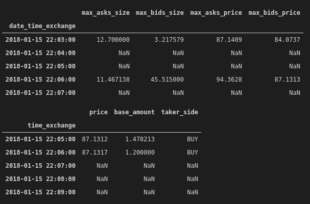
Having NaN values is not a problem, will be ignored by Plotly.
Let’s plot it:
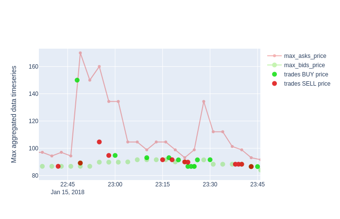
We can see confirm that around 22:45 the spike happened and the situation normalized one hour later, but just one trade happened with an increased price, so no cumulative effect was present.
Conclusions
EDA is a fundamental activity to perform on data and performing it efficiently with simple but powerful tools can be really time-saving, allowing to focus on the intuition and not on the code.
There are several libraries available to do data visualization and for sure Plotly is one of the more powerful and easier to use, especially with the latest version, so grab some data and give it a try!
---------
Sono un Coach specializzato e IT Mentor, con 25 anni di esperienza nel settore IT. Se vuoi migliorare la parte Tech della tua Azienda o migliorare te stesso/a, sono qui per supportarti. Scopriamo insieme come
Sono un Coach specializzato e IT Mentor, con 25 anni di esperienza nel settore IT. Se vuoi migliorare la parte Tech della tua Azienda o migliorare te stesso/a, sono qui per supportarti. Scopriamo insieme come
